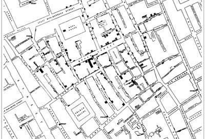
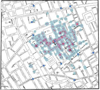
Since the outbreak of the Corona virus late in 2019, GIS has been widely used to elucidate and understand the spread and containment of the virus, but as early as 1854 Dr. Jon Snow used the principles of GIS to show the origin and spread of cholera in Londen in what is now known as Snow's map.
The following excerpt is from Rachel Steenson's article:
The first example of linking the 'what' with 'where' takes us all the way back to 1854 and a cholera outbreak. At the time, people believed that the disease was being spread through the air. But an enterprising English Doctor, Dr Jon Snow wasn’t convinced. So, he decided to map the outbreak locations, the roads and the property boundaries and the water pumps. And, when he did, he made a startling discovery. A pattern emerged. This pattern proved that the disease was not in fact airborne but was being communicated via water and even more specifically by one infected water pump. John Snow’s cholera map was a major event connecting the what with the where.
Not only was this the beginning of spatial analysis, it also marked a whole new field of study: Epidemiology, the study of the spread of disease. Snow’s work demonstrated that GIS is a problem-solving tool. He put the what on a map to show the where and a made a life-saving discovery.

Dr Jon Snow’s original map showing the outbreak of cholera against the location of the water pumps.

Dr Jon Snow’s original map showing the outbreak of cholera against the location of the water pump
Reference: Rachel Steenson: The history of Geographic Information Systems (GIS)